Introducing Tenant Connect - an app and website designed to foster community in apartment complexes. With its user-friendly features, tenants can easily connect with their neighbors and manage their rent and maintenance requests.
Moving to a new place can be a daunting experience, especially without any local friends or family. While there are existing apps that cater to single-family house neighborhoods, they often don't cater to apartment complexes.
Tenant Connect aims to fill this gap by providing a simple and stress-free way for tenants to build relationships with their neighbors and manage their rental needs.
I conducted research using surveys on LinkedIn and interviewing family and friends that currently or previously lived in an apartment complex with the following goals in mind:


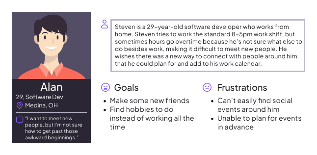
Based on the initial research, I created personas to represent the user base and their pain points to better empathize when thinking of design solutions.
This is an example of one of the personas and their problem statement.
Problem Statement:
Steven is a single, busy software developer who wants to easily find opportunities to meet new people around him because he has a difficult time pulling himself away from his work, but wants to make new friends.
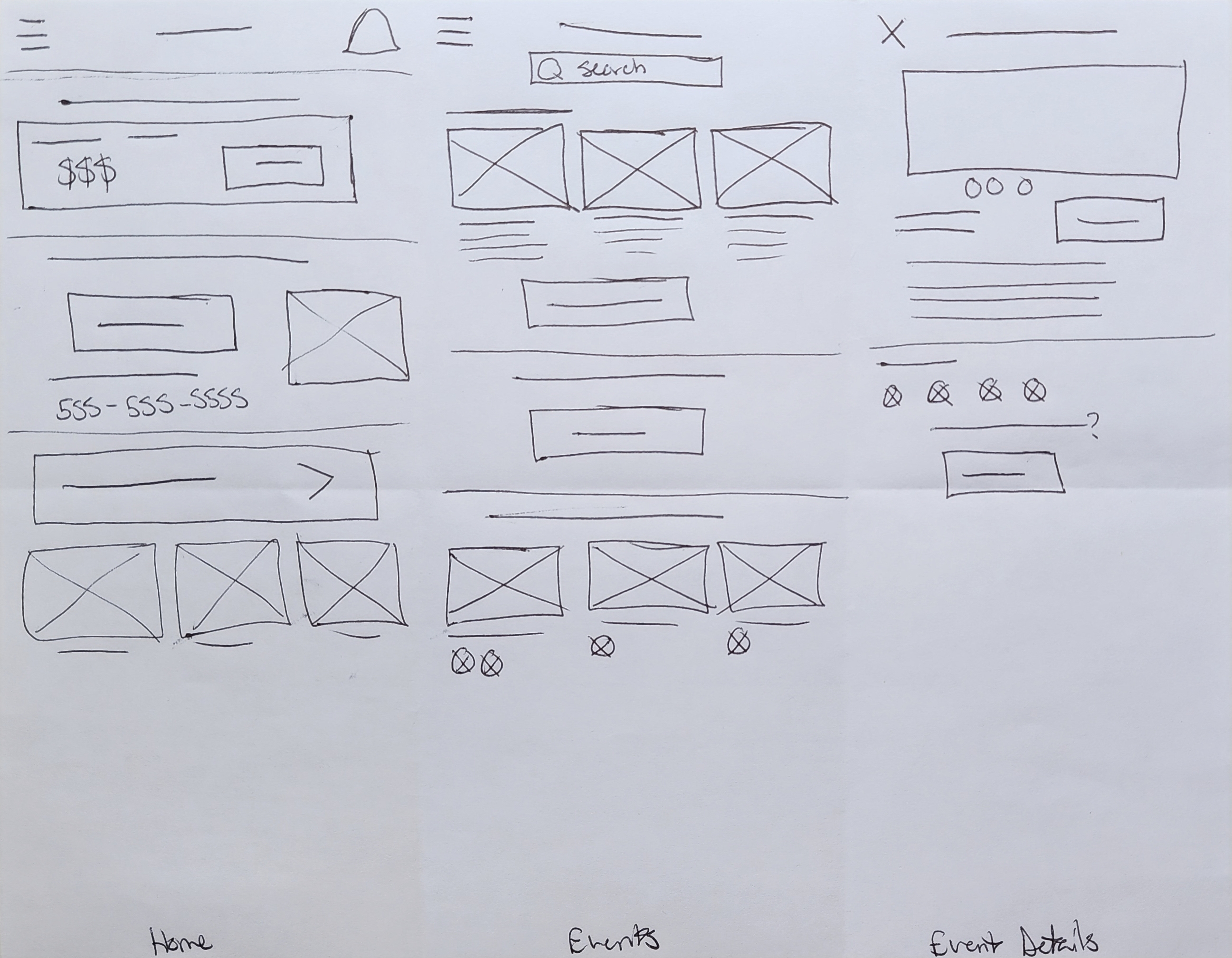
To come up with ideas for my project, I used Crazy 8 techniques and How Might We questions. I sketched out at least five different ideas for each screen that I needed. I experimented with different layouts for the home screen, some with a navigation bar at the bottom and others with large, focused buttons to make it easy to find different user flows. After trying out different options, I marked my favorite parts of each layout and used them to create the final version of my paper wireframes. Check out the different versions of the home screen I created here.
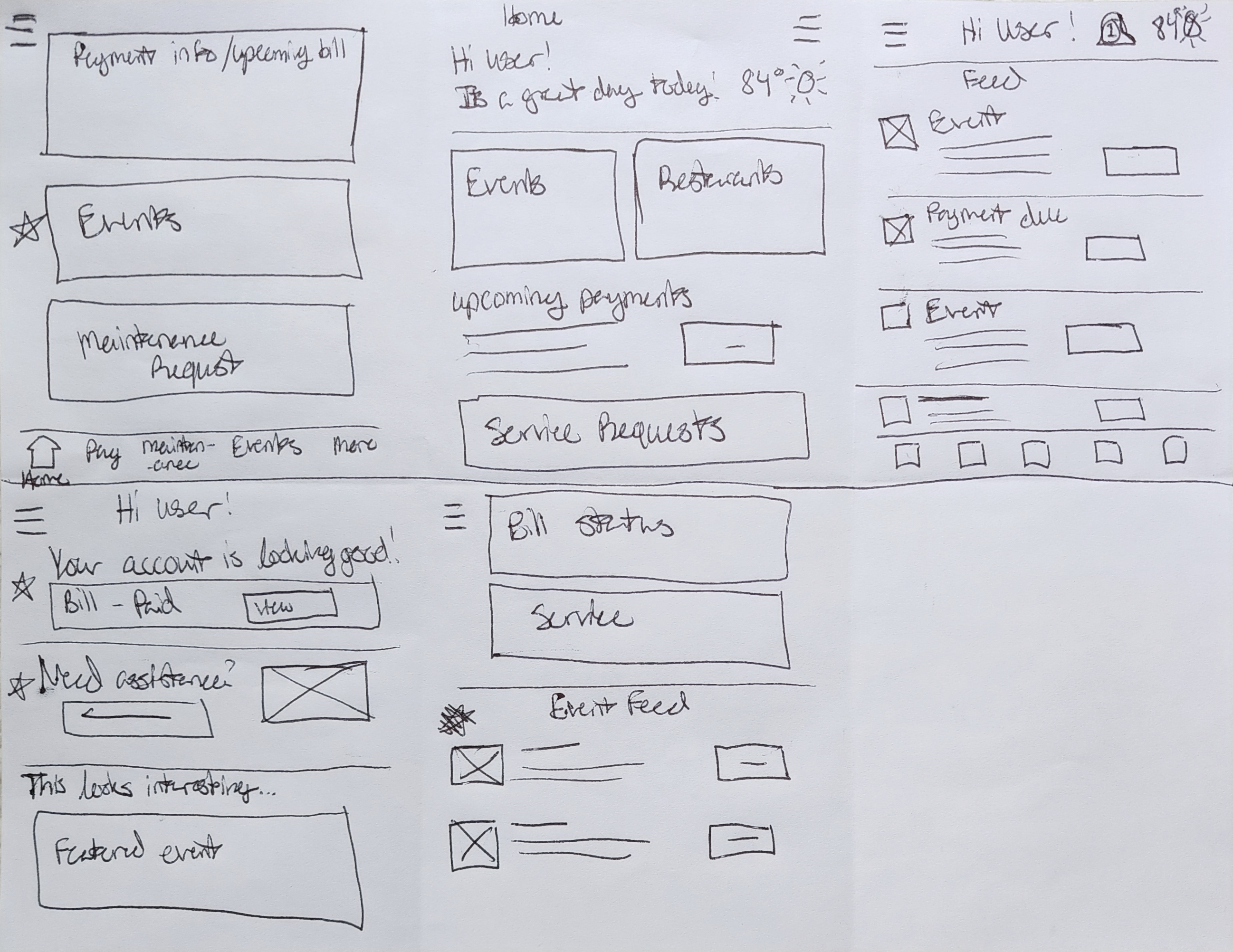
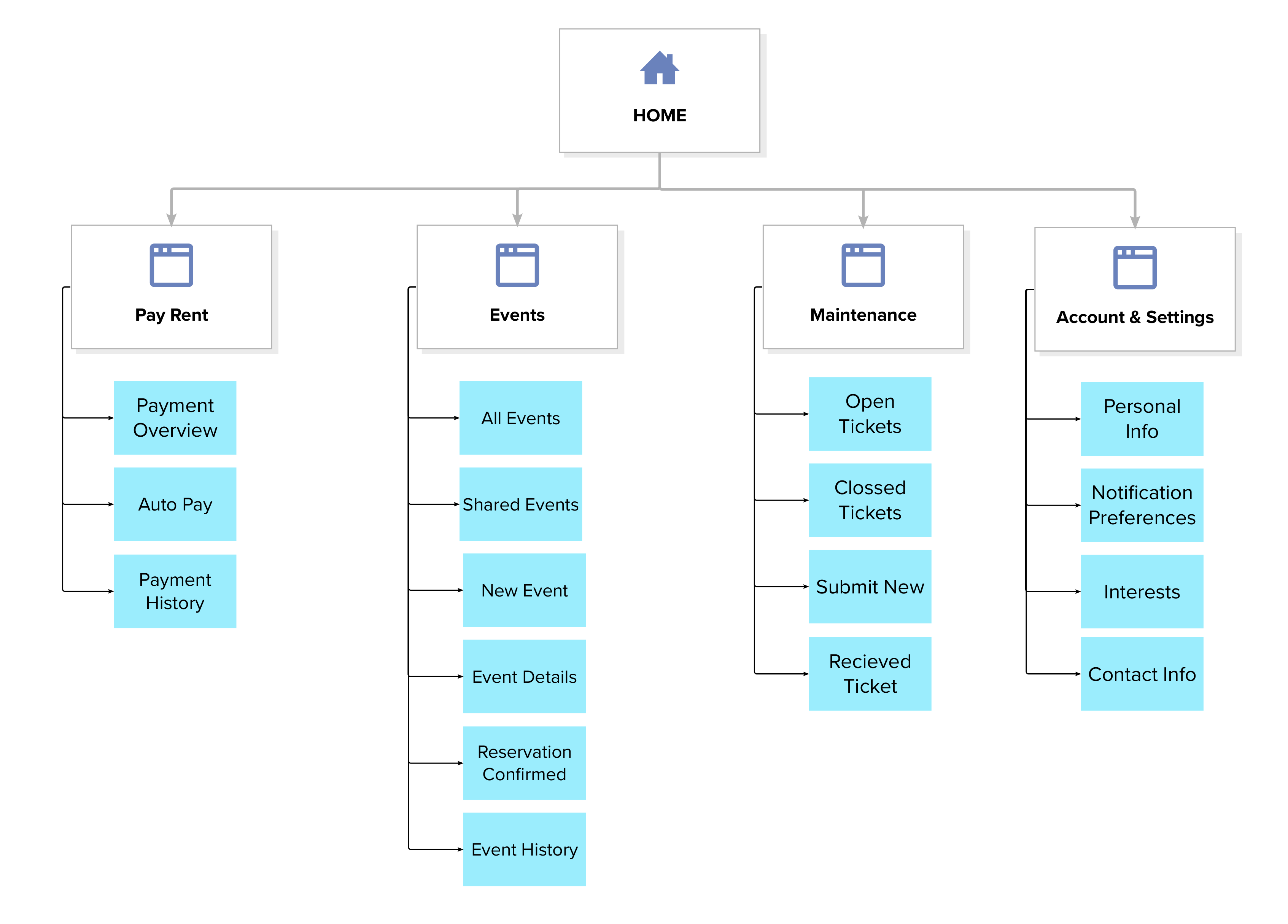
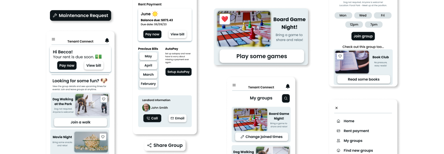
After brainstorming, I carefully selected the most promising ideas and features from each screen and merged them together. To ensure the best user experience, I examined all possible user journeys based on the personas I created for the project. I prioritized having a central location to manage rent, followed by events/groups and maintenance. These concepts served as the foundation for my initial digital wireframes.
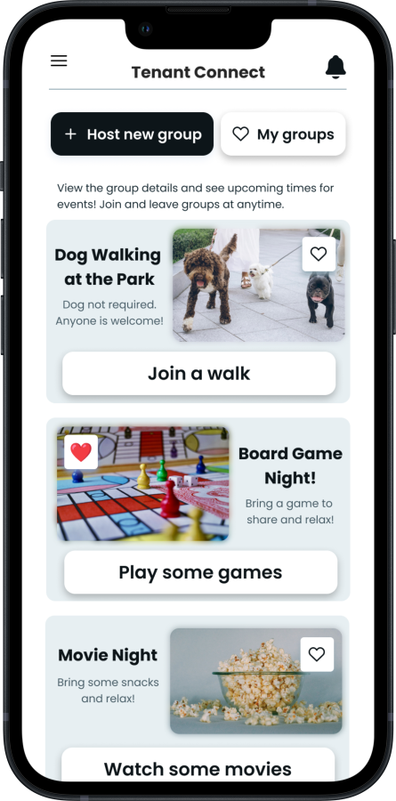
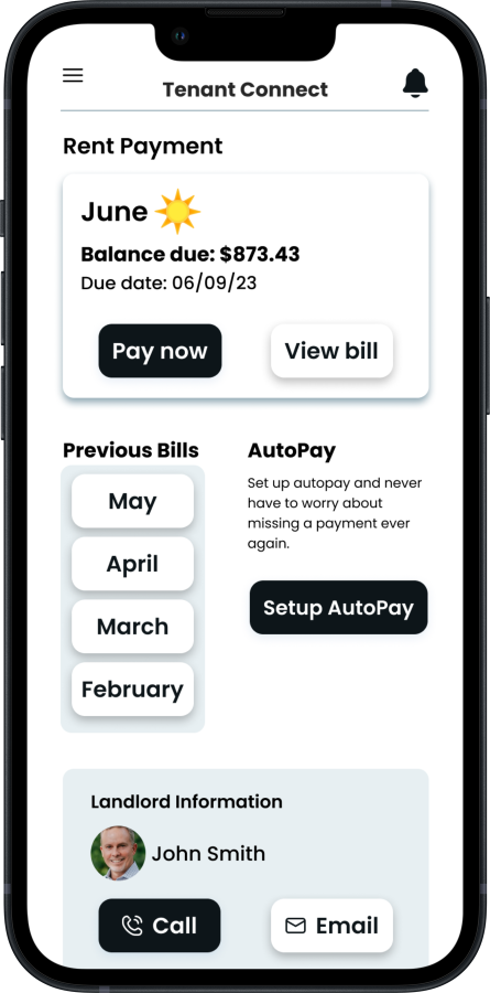
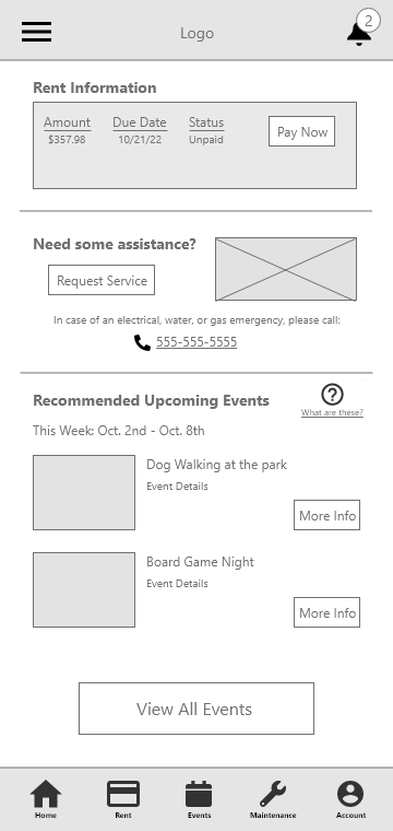
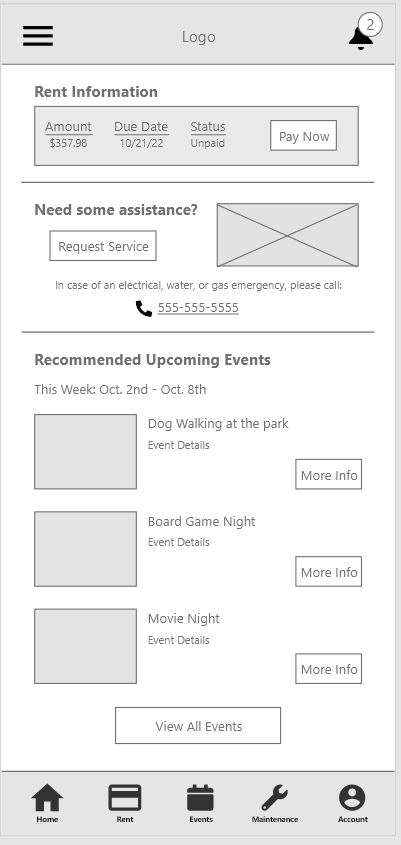
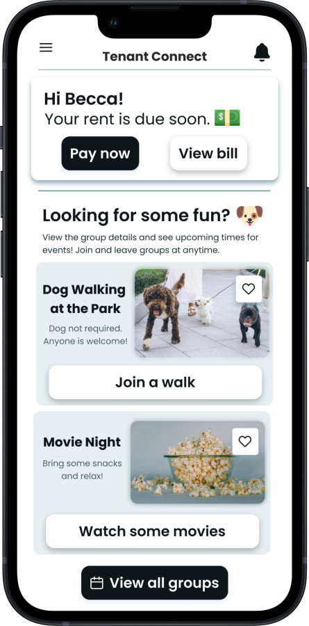
After analyzing and consolidating the ideas sketched out in the paper wireframes, I effortlessly translated them into the digital realm with Adobe XD. The process felt seamless and intuitive as I progressed from creating low-fidelity prototypes for testing to high-fidelity mockups. The starting/home page of the app prominently displays the core functions, including paying rent, requesting services, and browsing events, making it incredibly user-friendly and easy to navigate. With this design, users can expect a positive experience and find the app effortless to use.
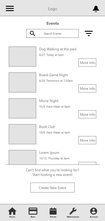
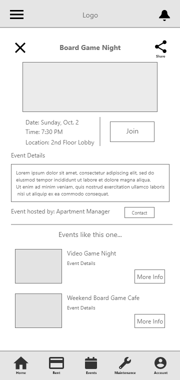
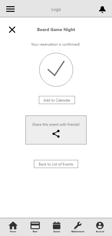
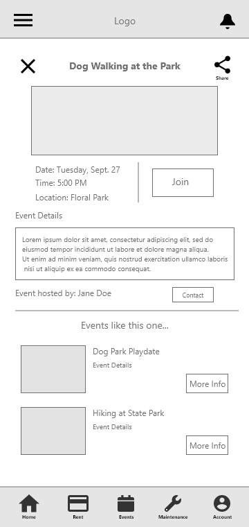
The low-fidelity prototype using these digital wireframes include the user flow for browsing and joining an event, as well as submitting a maintenance ticket (link will open in a new tab).
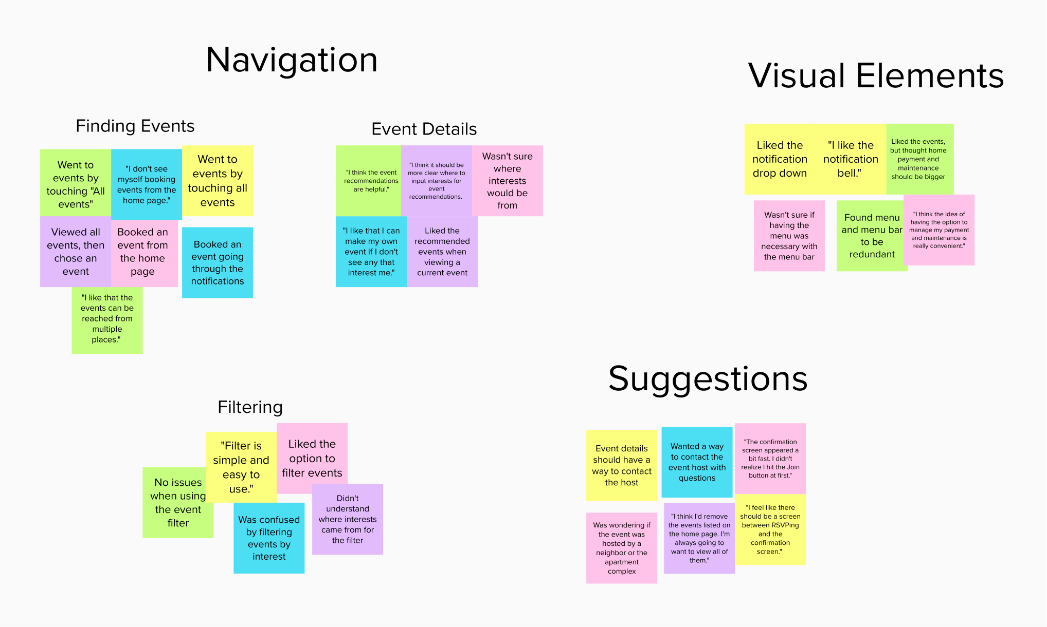
I conducted a moderated usability study after creating a low-fidelity prototype and requested feedback from my peers, friends, and family members. The findings from this study and the affinity diagram can be seen below:
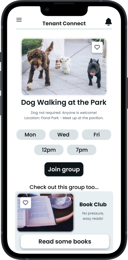
With this information in mind, I created the hi-fidelity mockups for the app and made changes accordingly, like increasing the contrast on the button to view all events so that it’s easier to find. I also removed the navigation menu from the top left, and simplified the bottom navigation bar.

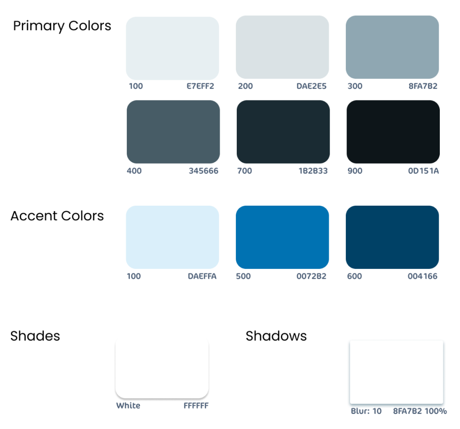
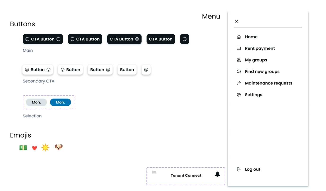
When designing this app and website, I took great care in selecting the colors, fonts, and iconography to ensure a modern and minimalistic feel. Of course, these choices can be tailored to fit the branding of any apartment complex, but my priority was to create a clean and visually appealing design. I followed the WCAG guidelines closely to ensure that all buttons, menus, headings, and text were highly readable with excellent contrast.